
Stewarding donors is a process that requires both making a positive first impression, and then following up with continual thank yous, engagement opportunities, and more. When done right, your nonprofit will be able to retain more donors, earning your organization reliable revenue and larger donations, including major gifts.
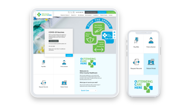
Your website is a core part of this process and should help contribute to that positive first impression, no matter what device your donors are using. Picture this: your nonprofit is running a new fundraising campaign for Giving Tuesday. One of your supporters sees your campaign on your website and decides to help out by sending links to their friends. But when their friend opens it on their phone, they have to scroll and scroll horizontally to read a single line of text!
You can avoid situations like this and make the most of your online campaign’s potential to recruit new supporters by optimizing your website for mobile use. To help your nonprofit create a better experience for your supporters online, this article will explore five ways you can make your website mobile-friendly:
- Use an adaptive web builder.
- Be selective about design elements.
- Make forms easy to fill out.
- Remove pop-ups.
- Reduce loading times.
Many of these tips can be implemented easily with minimal tech knowhow. However, if you discover that your website needs a little more work to get up to par with modern mobile optimized websites, don’t hesitate to contact a nonprofit website consultant for help. But first, let’s get started with the best practices you can enact now.
1. Use an adaptive web builder.
As part of your donor retention strategy, your website should serve as an online hub for your supporters to learn about and engage with your organization. Of course, your supporters are also busy people and will want to access your website on a variety of devices, including phones and tablets.
You can account for all types of screens with a website builder that adapts your website to your visitors’ screens. Morweb’s guide to website builders for nonprofits recommends looking for a platform with responsive design and the additional following features:
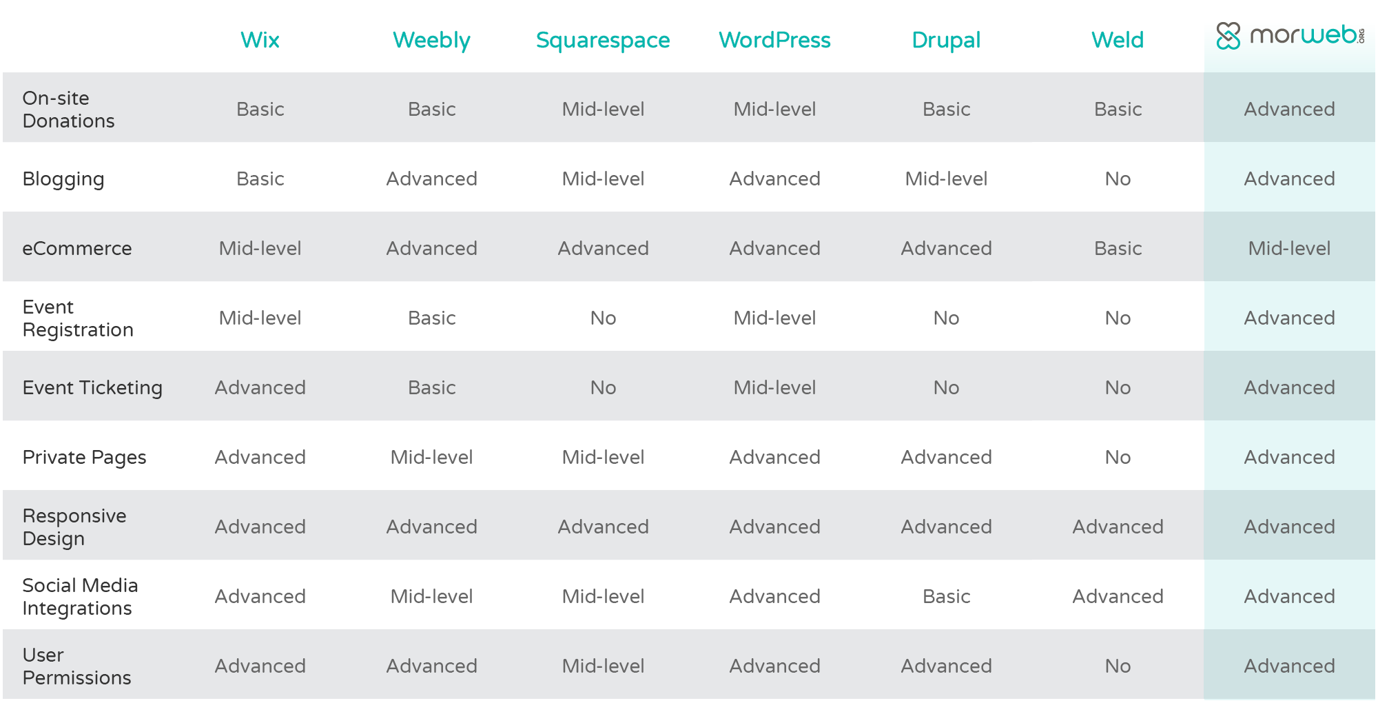
- On-site donations
- Blogging
- eCommerce
- Event registration
- Event ticketing
- Private Pages
- Social media integrations
- User permissions
With these features, you’ll be able to build a website that accommodates both your staff’s needs for backend support tools and your visitor’s frontend mobile user experience.
If you’re already using a website builder with responsive design, you can still optimize your pages further to determine exactly how they’ll display on your visitor’s screens. If your website builder doesn’t have responsive design or you’re using a theme that doesn’t optimize for mobile automatically, you will need to manually adjust your page formats for different sized screens or even look for a new platform.
2. Be selective about design elements.
Mobile devices have far less screen real estate than desktops. This means you’ll need to be thoughtful about which elements you’ll display for mobile visitors and where. For example, a bold hero image that takes up the entire top half of your page can be a great way to draw in visitors on the desktop version of your website, but it may lead to a lot of frustrating scrolling for mobile users.
When optimizing pages for your mobile site, consider how you’ll display the following design elements:
- Your logo. It’s good website design to have your logo on every page of your site, as it’s a core part of your nonprofit brand identity. When adding your logo to the mobile version of your website, you can go simple and just add a smaller version at the top of each page or create a sticky menu that includes your logo so visitors will always know what site they’re on.
- Images. Lots of images can grab your visitors’ attention and help communicate your nonprofit’s mission and values. However, decorative images can take up space on small mobile screens that can potentially be used for other, more vital features.
- Videos. Videos give visitors a new way to learn about your nonprofit and help break up blocks of text. However, you should be sure to avoid auto-play videos, because while they can slightly annoy desktop users, mobile visitors will likely have a hard time pressing small pause and play buttons.
Some of your design elements may just need to be resized for mobile, while in some cases, it may be necessary to create mobile-specific versions. It’s extra work, but the potential payoff is a better user experience for your mobile visitors, which can lead to increased support from a large portion of your audience.
3. Make forms easy to fill out.
Forms are one of the most important parts of your website, whether they’re for donations, volunteering, event registration, or other engagement opportunities. However, filling out forms can be a challenge for mobile users if they aren’t properly optimized. You can help out your mobile users with these best practices:
- Add multiple choice options. Typing out information always takes longer on mobile than desktop. You can help out your mobile visitors by adding multiple choice options, allowing them to pick their responses easily and provide more information with an “other” choice and an optional text box.
- Make buttons large and clickable. Fingers tend to be less precise than a desktop mouse. Make it easy for your visitors to select your form’s elements and press submit by making your buttons large and easily clickable.
- Ensure your forms are accessible. All of your website’s users should be able to access your forms. Screen readers and other assistive technology can have trouble navigating forms if proper precautions aren’t taken. For instance, ensure that you add directions outside of each information field so your visitors can always refer back to them, even as they type.
Many of these best practices will apply to other parts of your mobile website, but they’ll be most notable on your forms where visitors will be actively engaging with your content. If you have a group of donors you want to regularly interact with, improving your forms can lead to higher member engagement and overall decreases in form abandonment.
4. Remove pop-ups.
When used strategically, pop-ups on the desktop version of your website can serve as reminders and calls-to-action, encouraging guests to donate, sign up for your newsletter, check out your merchandise, and more. However, pop-ups tend to be less helpful on mobile devices, and search engines will even de-prioritize mobile websites with pop-ups.
If your website uses pop-ups, ensure that they are only turned on for the desktop version of your website. Pop-ups often fill up mobile screens, and the buttons to close them can be difficult to click, which can result in users accidentally opening pages they didn’t mean to or generally having trouble browsing your website.
You can still create calls-to-action on your mobile site, though. Instead of using pop-ups that fill the screen, look into adding banners that inform guests about the same opportunities. These take up less space but can still be eye-catching engagement tools.
5. Reduce loading times.
As 360MatchPro’s fundraising statistics report shows, mobile donations are growing year after year. However, your website’s mobile donation rate will only increase if they’re able to access your website in a timely manner. While all of your visitors appreciate fast load speeds, mobile users are like visiting your website while on the go and will value them even more.
Here are a few strategies for decreasing load times and letting visitors access your content faster:
- Reduce image file sizes. Images are one of the most common culprits behind slow websites. You can reduce your image’s file size by ensuring they are only as big as they need to be for your site layout. You can also compress their file sizes without losing image quality using free online tools.
- Clean up files. Duplicated images, redirect chains, and unnecessary files can accumulate over time. Take the time to perform website maintenance and handle these issues before they have time to pile up and significantly decrease your site’s speed.
- Use only necessary add-ons. Add-on features can add new elements to your website, potentially increasing your visitors’ interest and engagement. However, unnecessary code, plugins, and other features can slow down your website. Plus, with advice from a nonprofit website consultant, you can often find a simpler solution that accomplishes what your add-on would without increasing load times.
Improving your load times creates a better experience for your human visitors and will make your website look better to search engines. Plus, certain fundraising opportunities, such as the Google Grant, will also take into account your website’s overall layout and optimization. While these assessments take many factors into account, faster load times will definitely work in your nonprofit’s favor.
Your website is one of your nonprofit’s top tools for attracting and engaging donors. Ensure that your supporters can always access it, no matter what device they’re using, by following these optimization tips. If you need more help implementing some of these tips, try reaching out to a nonprofit website consultant for help. Good luck!