Keeping donors engaged is one of the most challenging parts of running a nonprofit organization. In fact, donor retention hit the lowest rate ever recorded at 42.6% in 2022. With so many donors lapsing, nonprofits are confronted with this critical question: how do you keep supporters connected to your cause and eager to give again?
If you’re looking for a reliable way to market your organization, boost fundraising, and drive donor engagement all at once, look no further than the power of strong web design. A well-designed website is a critical component of forming lifelong partnerships with supporters. With the right copy and visuals, your organization’s website can help push supporters along the donor journey to giving more frequent and larger gifts.
To boost donor engagement through your web design, leverage these top tips:
Your website is prospective supporters’ first glimpse into who you are and what you stand for. With a strong web design, you can make a lasting first impression that will keep visitors engaged and eager to back your cause. Let’s begin.
1. Invest in the right website builder
Your nonprofit’s team has a lot on its plate, from leading donor stewardship efforts to planning your next fundraising campaign. Building a website from scratch can require hours of coding and complicated web development programming, which you probably don’t have time for. To streamline your web design, leverage a content management system (CMS) designed with nonprofits in mind.
Morweb’s guide to nonprofit website builders recommends looking for a solution with the following key features:
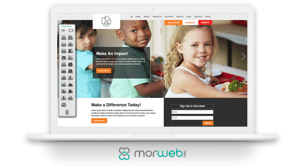
- Drag-and-drop editing: A smooth drag-and-drop experience allows you to upload your content to any page and make adjustments in just moments. Simply add in engaging images, text, videos, and more with one click and watch your page adapt to these changes in real time.
- Security: Your website will likely process private donor information, including contact and billing details. To protect your donors’ information from getting leaked and maintain trust with your supporters, leverage a proprietary website builder. A proprietary CMS, in contrast to an open-source website builder, won’t release your source code to the public (and therefore your private data) and will automatically roll out security updates on your behalf.
- Ready-to-go website templates: Website templates take the guesswork out of web design and provide you with an adaptive, accessible layout that will contribute to a positive user experience. The right website builder will offer a number of templates so you can choose the right layout for your organization. Plus, you should be able to easily customize template features like font and color scheme to align with your nonprofit’s branding.
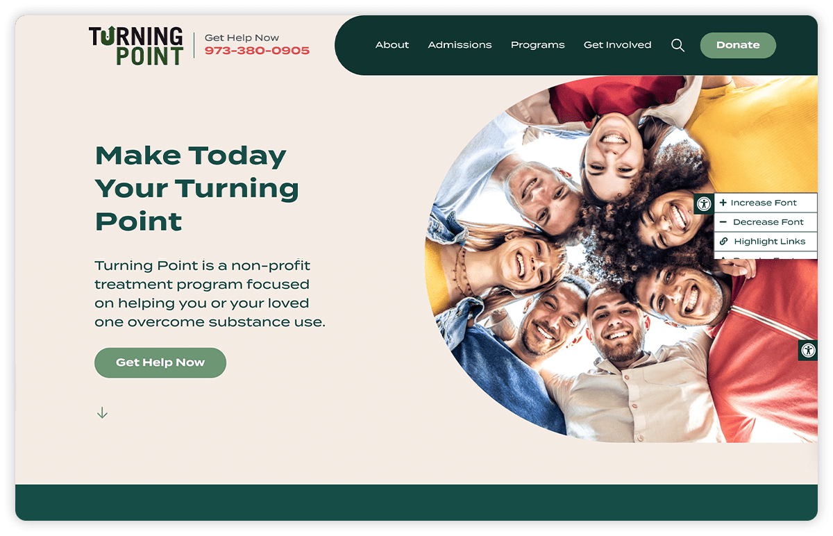
- Built-in accessibility tools: Web accessibility ensures that people of all abilities can navigate and engage with your website, no matter what device they’re using. Look for a website builder that offers automatic mobile-responsiveness and an accessibility widget so supporters can easily adjust content like font type and size to fit their unique needs.
- Integrations: If your organization uses donor management software or a CRM, you will want a CMS that is capable of integrating with these platforms. This way, data collected from your donation and registration forms can be pulled from your website and automatically transferred to your CRM so you can keep track of supporter activity with ease.

Backed by the right website builder, you’ll be in great shape to design an intuitive website that will drive donor engagement and keep supporters invested in your nonprofit’s success. Although leveraging a website builder is an investment up front, you’ll save time in the web design process and drive a high ROI in the long run with your donor-centric website.
2. Brand your website
Once you have the right website builder, you’re ready to dive into building an engaging digital presence. To start, you’ll need to weave elements of your branding throughout your website.
Your brand helps to communicate who you are to new supporters and strengthen connections with existing supporters. Specifically, branding your website will empower your nonprofit to:
- Boost your visibility and expand your reach
- Establish credibility as a trustworthy organization deserving of donors’ support
- Create a visually appealing web design that grabs users’ attention and invites them to explore your content
To access these key benefits, incorporate the following branded elements into your website:
- Color scheme: Colors can evoke different emotions in your audience and showcase your brand personality. For example, blue is often associated with formality and professionalism, green is tied to growth, and red is associated with passion and immediacy. Choose two to three colors that work well together and convey your nonprofit’s values and purpose.
- Fonts: Select a body and header font and use them consistently throughout your website to create a cohesive reading experience. When choosing fonts, it’s important to prioritize readability so your visitors can readily engage with your content without getting distracted or confused. Many of the best nonprofit websites opt to use sans-serif fonts like Arial and Helvetica because of their straightforward design.
- Logo: Your logo should be a simple yet memorable design that stands out to supporters and immediately connects them to your organization and its cause. Double the Donation’s guide to nonprofit logos recommends choosing a symbol that communicates your mission and represents what your nonprofit stands for. For instance, many environmental organizations incorporate trees or leaves in their design to encapsulate their commitment to conserving the natural world. Once you’ve created a logo, feature it prominently across your website so supporters will see your logo on each page, reinforcing brand recognition.
- Tone and messaging: Along with your visual branding, it’s equally important to consider how you convey your messaging on your website. Make sure the way you describe your mission and projects and your tone are consistent throughout your website. For example, you might want to use a more formal tone to establish a professional, authoritative presence. On the other hand, a friendlier tone can appeal to younger audiences and create a welcoming feeling. Choose what makes the most sense for your organization and target demographic.

Make sure your branding stays the same not only across your website, but also throughout the rest of your marketing materials—including your social media, email newsletters, and direct mailings. This ensures that supporters can fully understand who you are without getting confused by mixed messages about your organization. As a result, you’ll be able to win their trust and turn casual supporters into loyal champions for your cause.
3. Create a streamlined donation page
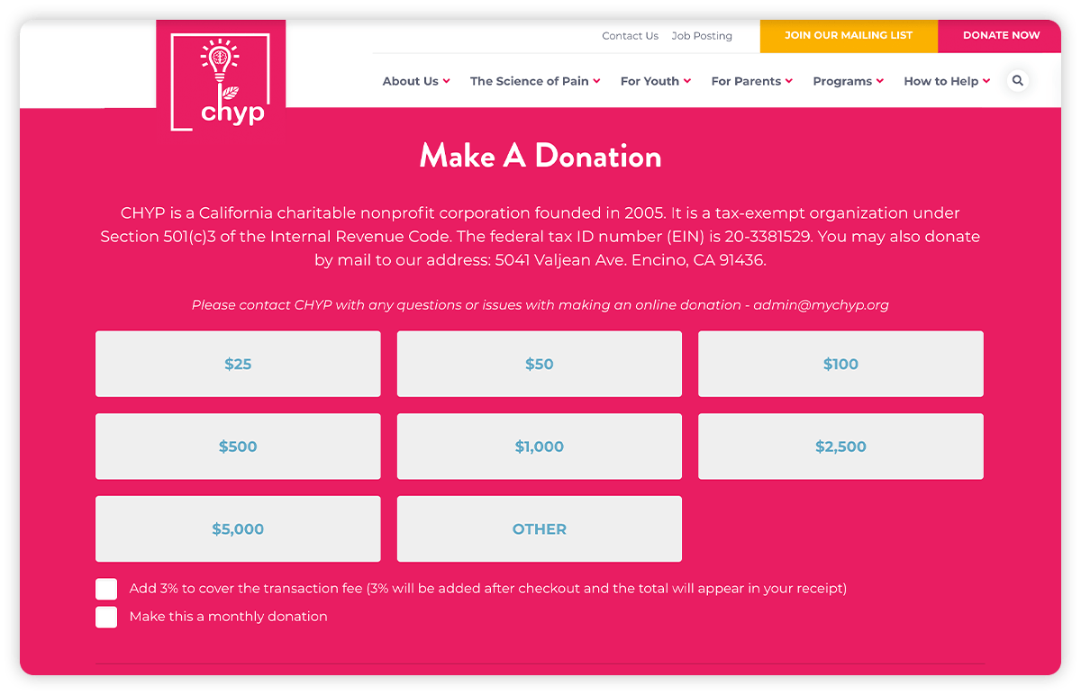
Your online donation page is the hub of your digital fundraising strategy. Many supporters will visit your page intending to donate, but if your donation form isn’t engaging or user-friendly enough, they might abandon it altogether.
When designing your donation page, keep these best practices in mind:
- Make it easy to donate. Keep the form questions short and quick to answer.
- Reiterate your mission to remind people why they’re donating. Include compelling visuals, such as a testimonial video from beneficiaries or images of your latest project, to emphasize how your nonprofit is using donations to make a difference.
- Limit your donation form to one page. If it’s too lengthy, people may leave the form before completing their donation.
- Leverage a secure payment processor. Find a tool that allows you to securely process your donors’ transactions using a variety of safeguards and fraud protection tools.

Cleaning up your donation page will help improve your conversion rate by encouraging more completed donations to your cause. Remember to keep your audience in mind as you design your layout and prioritize their user experience.
The Gist
Your website is a powerful tool for driving donor engagement. You can capitalize on this potential by putting donors at the center of your design strategy and creating appealing, user-friendly content that will spur them to act. As you roll out your web design updates, leverage your website builder to actively track metrics like page views and conversions. Then, adjust your strategy as needed to optimize your results.


